When I first sat down and discussed how to approach this project, I realized that Cable Shield not only required a new website that would market the product, but the company needed a specific identity that would instantly showcase that the product is designed for electrical vehicles.
Since the client already works in the car and trucking industry, I wanted to create a logo that unified their work with their private company. Not only that, but since the clients are of Slovenian descent, the color way was suggested to be RED, Blue and White since it resembles not only the Slovenian flag, but the American one as well.
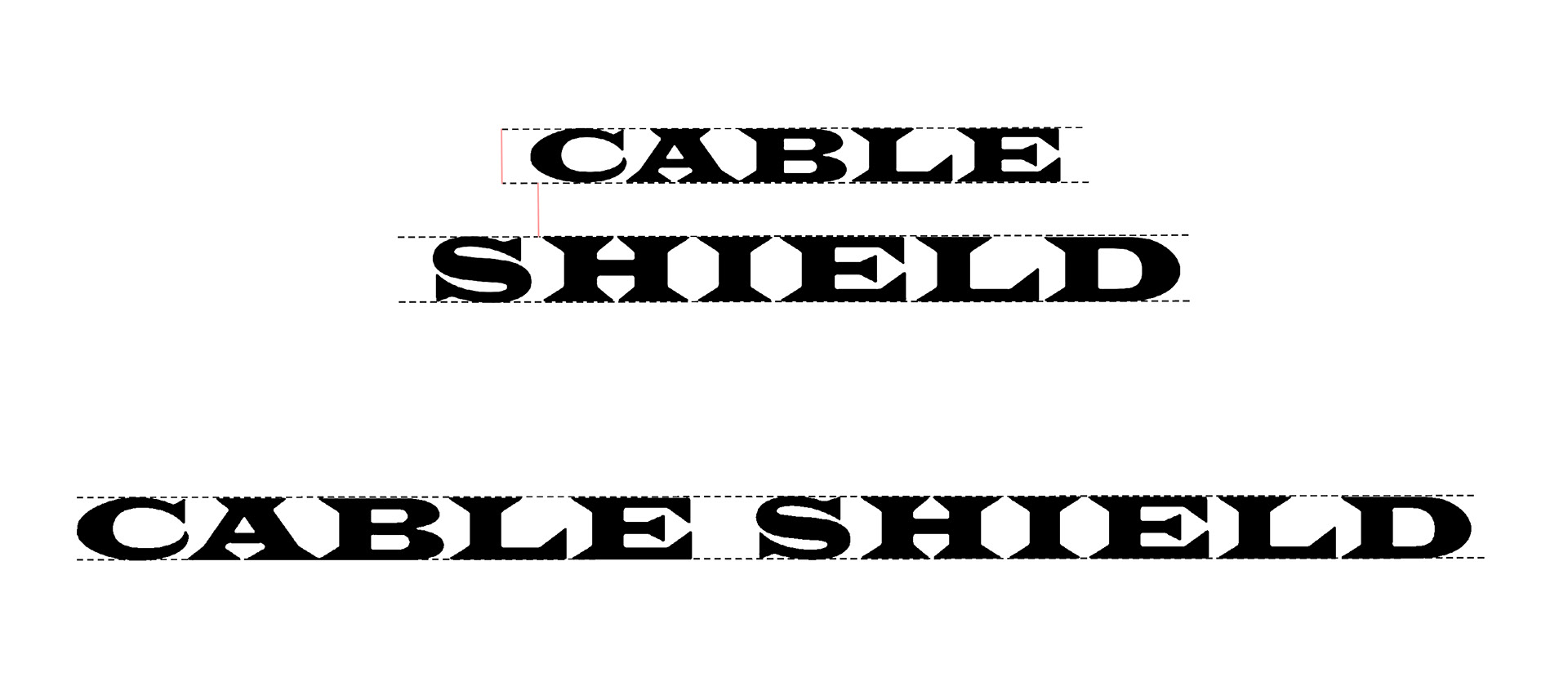
Once I had the overall direction, I spent time looking for the font and chose Songti SC, by dafont.com. Not only does the font provide a modern look to the brand, but it also gives resembles to a shield, which is a part of the brands name.
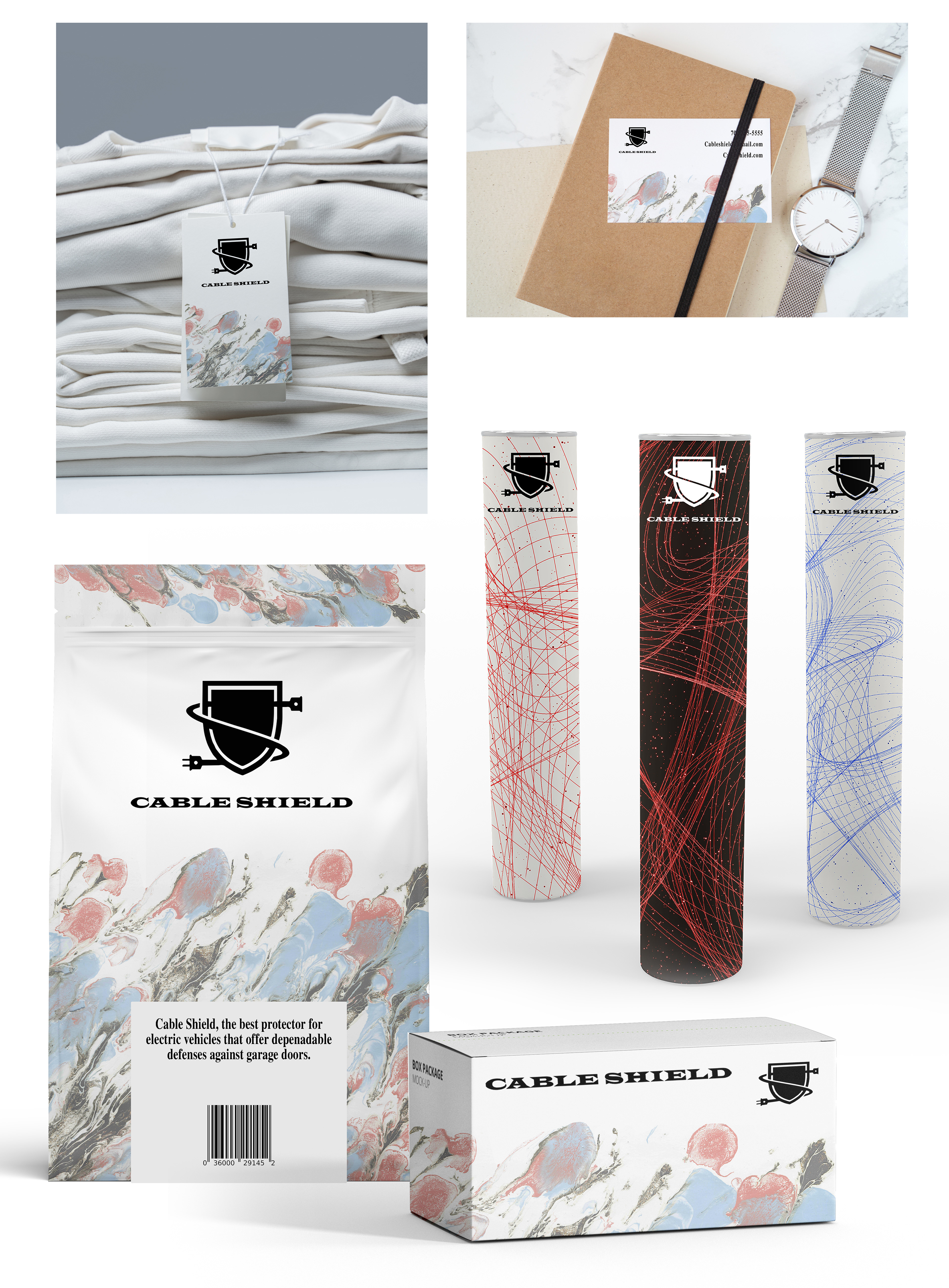
Shortly after the brands design came to fruition, the client requested for a packaging design as well. From a shipping package and business cards to merchandise design, the combination of all gave the product an identity and a professional look for it's customers.
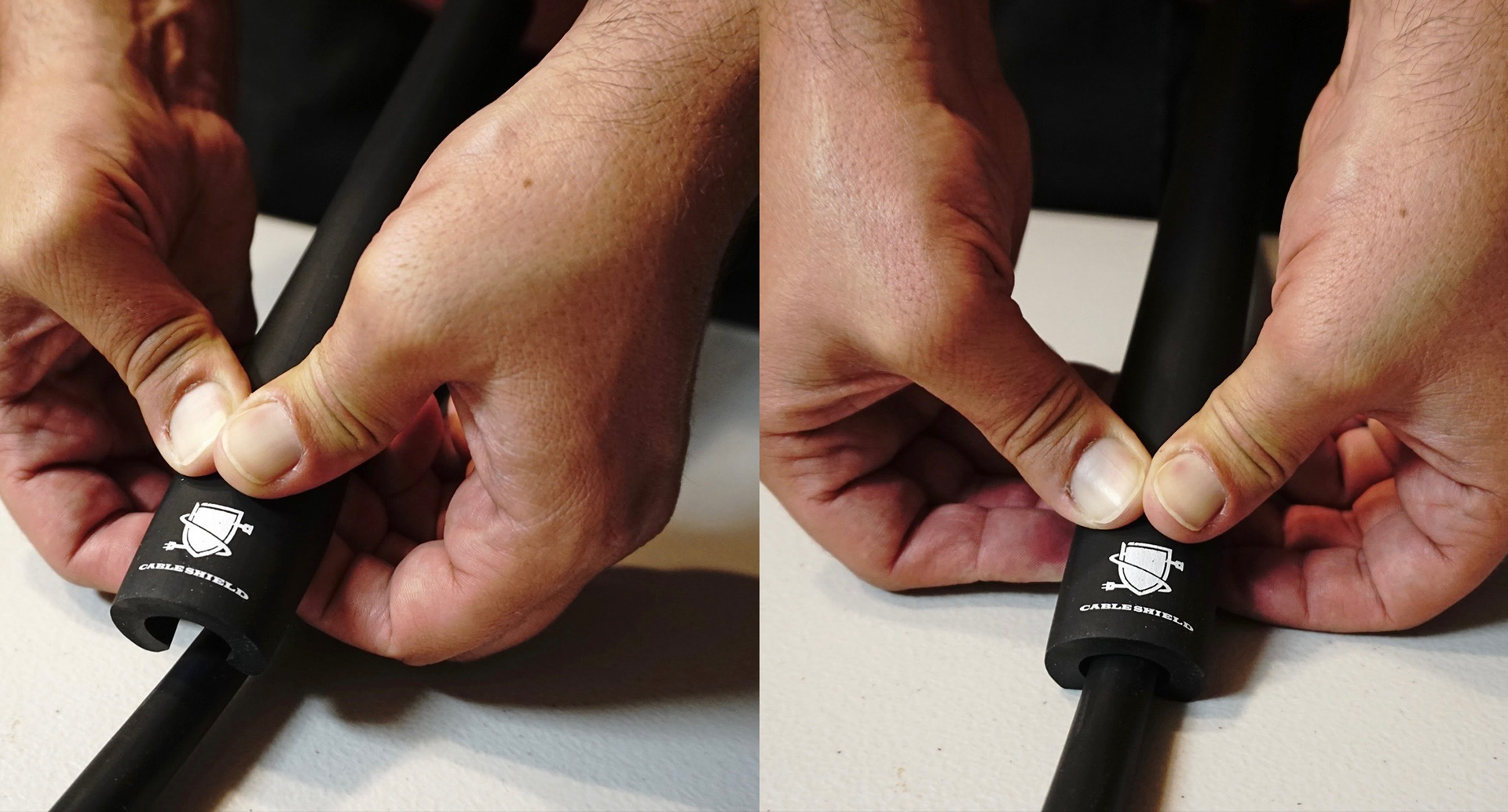
Product stills taken by me, and used to create a website and market the product across different platforms such as Instagram, Facebook, Amazon, and E-bay.
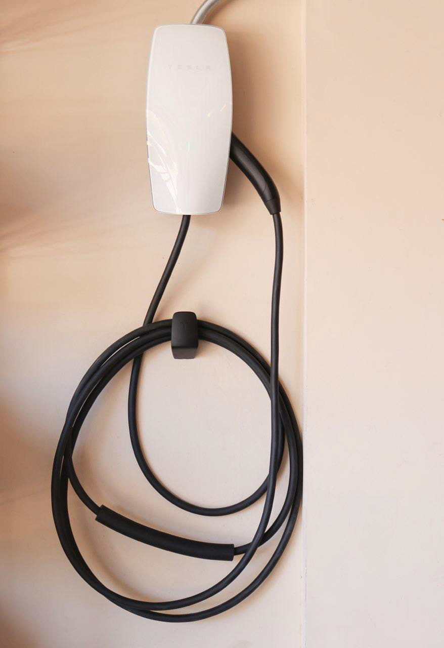
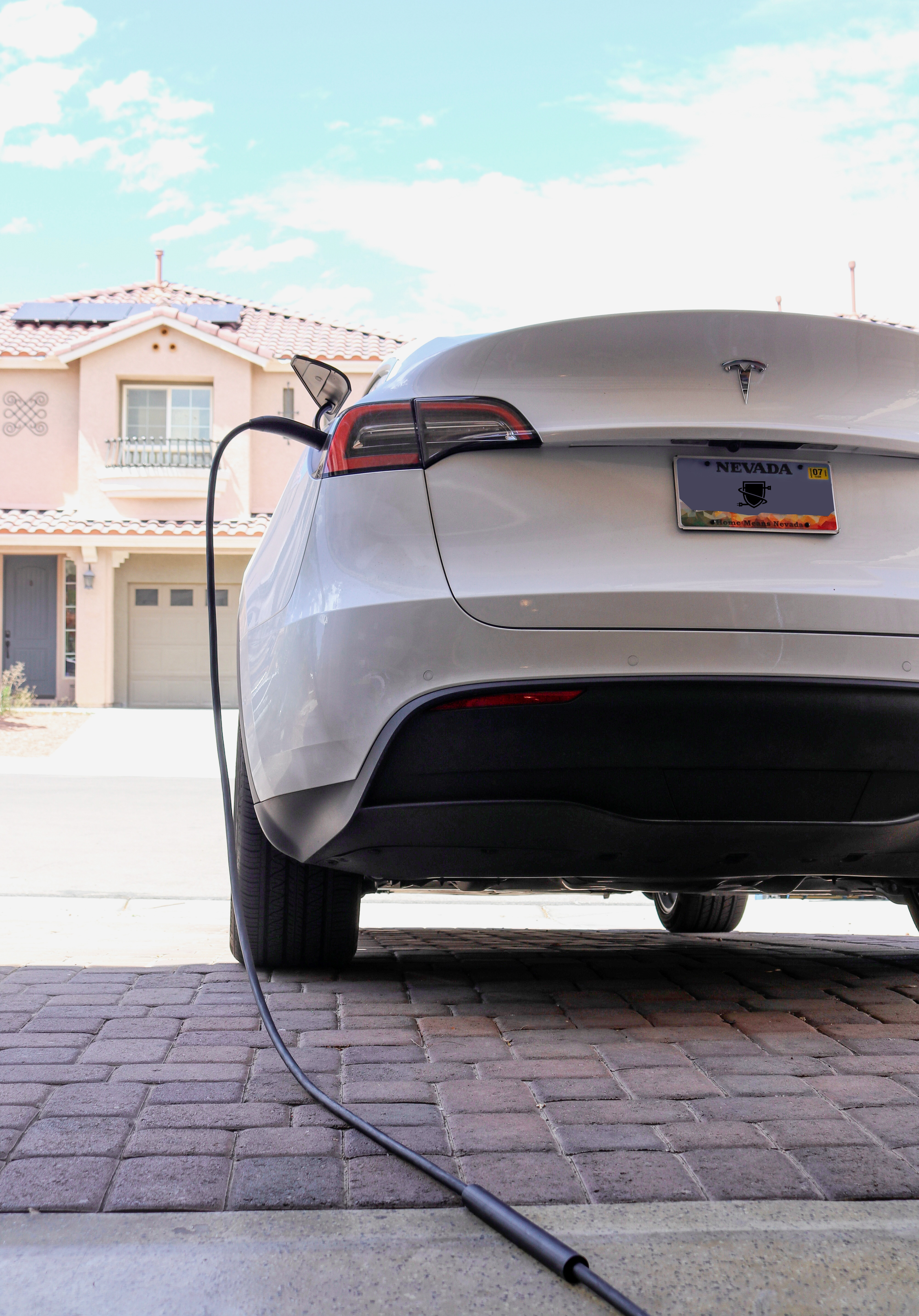
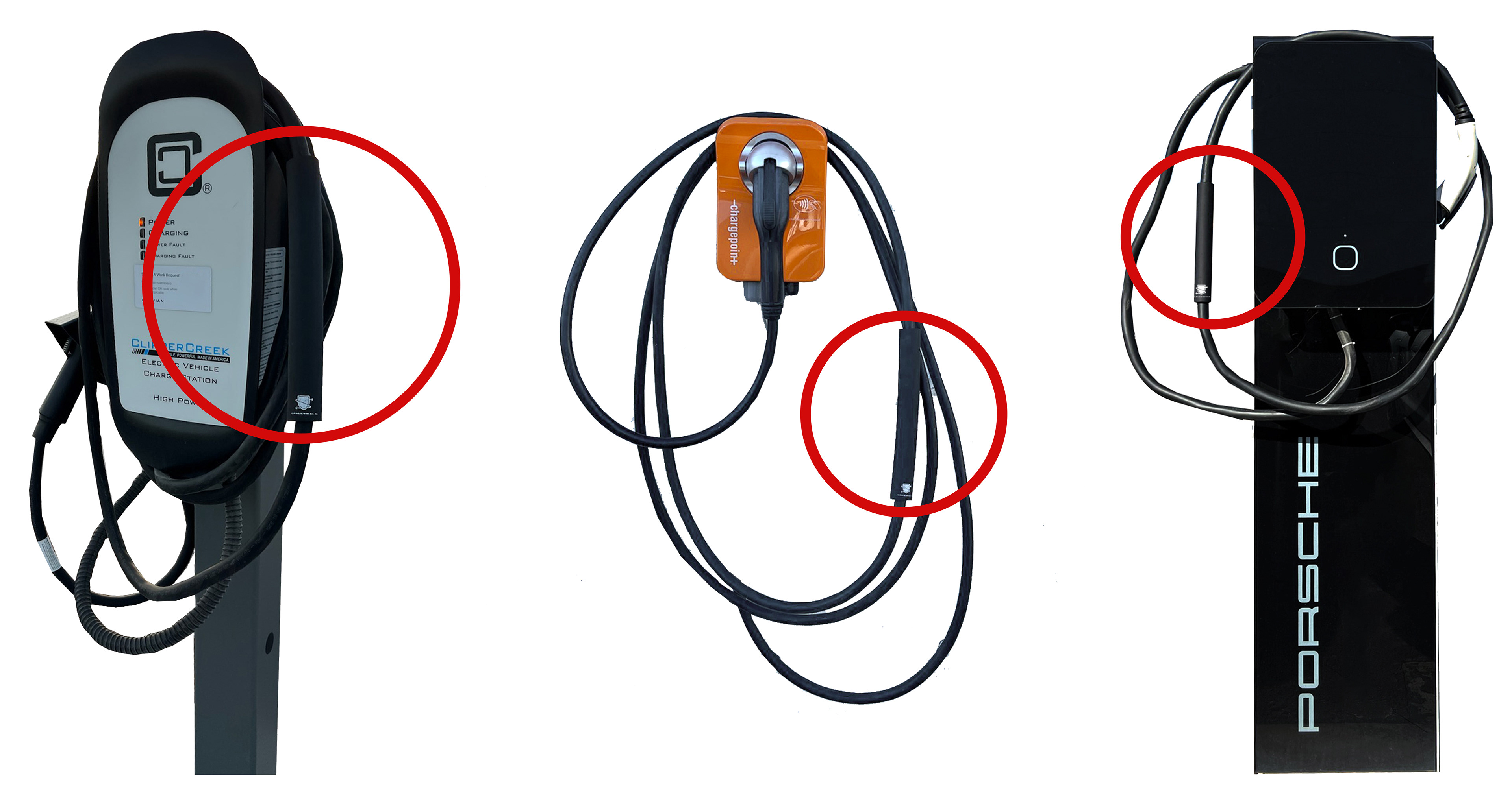
Product seen and captured being used across different battery stations that belong to high-end electrical vehicle manufacturing companies in the country.